App Journeys: How Tiffany Rothe Launched Two Mobile Apps for Her Online Fitness Community.

Editors Note: AppAddictive has built numerous apps for celebrities and business since its founding in 2010. As part of our commitment to help appreneurs get their start in tech, we’re sharing stories of people who have successfully run app-based businesses for their communities.  From best practices to ways on how to acquire users and retain customers, we bring key learnings direct from the source. We hope you enjoy it!

Since uploading her first video in 2010, Los Angeles based Tiffany Rothe has garnered an impressive 110,000,000 views on  YouTube. Through her 10 minute routines, she has built a community that’s committed to burning fat, toning muscle and lose weight.

From Youtube Celebrity to Mobile Apps

Tiffany has always wanted to have an app of her own. “I believe that every action begins with your thoughts” shares Tiffany. Initially she wasn’t really sure on how to go about it but her objective was pretty clear – she wanted to create a stronger community with her YouTube subscribers and fans.  Last year, she was approached by a company that specialized in mobile apps for online video celebrities. The mobile app company already had an existing model that covers app creation and monetization, all she had to do was say yes.

Her first foray in the app scene, called Tiffany Rothe, provides a companion app to her YouTube channel. After downloading the app, you can view her video, participate in user forums and take photos. She monetizes her app through a premium daily tips offering delivered via an audio snippet.

screen640x640

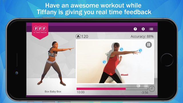
Tiffany has caught the mobile app bug. Early this month, Tiffany introduced “Train with Tiffany” – a groundbreaking exercise app that makes use of your mobile phone and its camera. The virtual workout provides you with the full Tiffany Rothe experience,  with new technologies like measuring accuracy, real-time feedback, social media sharing and gamification elements.

Done in partnership with a company based in Israel, it took her a year to develop and polish the app. This involved countless trips to a studio where she had to record video with a green screen, provided creative input and even got her hands dirty with user testing.  The end result was pretty impressive and it realized her vision of bringing a truly unique mobile experience. It was really an investment in time and tricky considering that she still had a YouTube channel to manage. “What really motivated me was when I finally saw the prototype and I was like “this is so cool!” says Tiffany. Seeing your labor of love launch after a grueling app creation process certainly paid off.

On the business side, having a portfolio of mobile apps is  great way for Tiffany to supplement revenues from YouTube. All her agreements with these technology partners involve some form of revenue sharing. This is good news for other celebrities who are looking to embark on their own app journey.

Transmedia Fitness

With her mobile apps, she’s transformed into a transmedia fitness celebrity. Her apps are now closely integrated with her programming making the experience more seamless. The interactivity provided via her apps also provide her with a constant feedback loop, allowing her to adjust her programming if necessary.

On top of her brand-new app, Tiffany is in the process of promoting her Inner Circle Fitclub (ICFC) through a reality show called “The Fittest Winner” that’s launching in August 2015. Something that’s never been done on the medium, her new program will feature an integrated reality TV/webseries where 8 contestants will participate in physical, emotional and mental challenges with Tiffany.  Of course, her “Train with Tiffany” app will feature prominently in  “The Fittest Winner”. At this point, we’re definitely staying tuned to Tiffany and her expansion to the tech world.  “It’s been a beautiful journey and I’d love to know what people think of it” says Tiffany.
Download Tiffany Rothe 

Download Train with Tiffany

Introducing AppAddictive Analytics

We’d like to take this opportunity to introduce another tool that would allow you, as a small-business owner to take control of your Social Media Marketing.


appaddictive-analytics

We live in an age where social media networks have significantly matured, with key networks like Facebook, Twitter, Instagram, YouTube, and Google drive traffic to your businesses. We know for a fact, that by keeping our customers in the loop, we get to increase our overall revenues with them. We at the AppAddictive have seen this happen with hundreds of thousands of fan pages installing our apps, brands leveraging our custom engagement apps as well as managing social advertising campaigns geared towards optimization.

And yet, it’s still a challenge for us marketers to really get the heartbeat of our social media assets. There are way too many platforms to worry about. While we’re happy with improvements pushed by Facebook and Twitter with their respective analytics support, we feel that there’s a need for us to put all of our data in one place. This way,we have the ability to stay consistent across multiple networks and adjust our marketing campaigns if necessary.

Of course, it wouldn’t hurt to keep tabs on the competition. :)

We are pleased to announce the newest member of our small-business suite, AppAddictive Analytics. This product is a result of countless amounts of customer-feedback based on years of making social media work for small-business.

With AppAddictive Analytics you can:

  • Easily connect your Facebook, Twitter, Youtube,Instagram, Yelp, Alexa and Google Analytics accounts for data tracking.
    A powerful RSS broadcasting tool which allows you to automatically and seamlessly publish content from ANY RSS feed to multiple social media accounts at the same time.
    Have a unified dashboard where you can have top-level overview of your social media assets.
    Answer the Whos, Whys and Whens – get a deeper understanding of your fans.
    Leverage on actionable insights you can use for posting updates.
    Track competitor’s social media performance and establish an industry index to add more context to your own data. Are your competitors outspending/outmarketing you?
    Set custom alerts on competitive activity.

On top of our core analytics offering, we also provide an easy and efficient way to post and multi-broadcast your messages on Facebook and Twitter. You can schedule your posts, consolidate your library of images that you use and see post performance in real-time. You can
easily access this via the Broadcast tab.

This is just the beginning. We’ll eventually introduce new features as the social media landscape evolves.

You can immediately start using AppAddictive Analytics by clicking here. No credit card required!

RIP Clickbait – It’s Time for a Better Facebook Newsfeed

8864978779_dc6ea22e54_b

Facebook continues its “War on Fluff” with yet another development, this time targeting the often abused practice of Click-baiting. 

It all boils down to quality at this point in Facebook’s history. With thousands of Facebook pages being created as well as content publishers taking advantage of these “hacks”, our newsfeed has never felt so crowded, full of tempting links that often bring us to underwhelming content. Sites like Upworthy and Buzzfeed got this right and have built high traffic websites (not to mention profitable businesses) around it. Just like its predecessors, in the form of content farms, the Internet does find ways to correct itself and make our lives a better. This was inevitable.

We can’t really blame Facebook on this one, click-bait content has been perfected as a science so much so that almost anyone can do it. In fact, you can even generate your own here. Facebook, in its post, is pretty transparent on how it determines if an article linked out constitutes link-bait

One way is to look at how long people spend reading an article away from Facebook. If people click on an article and spend time reading it, it suggests they clicked through to something valuable. If they click through to a link and then come straight back to Facebook, it suggests that they didn’t find something that they wanted. With this update we will start taking into account whether people tend to spend time away from Facebook after clicking a link, or whether they tend to come straight back to News Feed when we rank stories with links in them.

Another factor we will use to try and show fewer of these types of stories is to look at the ratio of people clicking on the content compared to people discussing and sharing it with their friends. If a lot of people click on the link, but relatively few people click Like, or comment on the story when they return to Facebook, this also suggests that people didn’t click through to something that was valuable to them.

So there you have it. I think most of our readers are generally safe from this practice. If you feel that you’re going to lose a lot of traffic here then it means that you’ve been relying too much on your headlines rather than the actual content. There are a lot ways to get that elusive click from your users, but it all boils down by being remarkable.

The bottom line is, content creators and page managers should put more sincerity in their content. While a lot of us need ways to generate content faster by following best practices and formulaic techniques, we should really focus on delivering value and teach our audiences a thing or two. You can still generate click-baiting-esque headlines, as long as there’s enough substance to back it up.

(Photo via Waag Society/Flickr)

Facebook is Banning the Like Gate. What Now?

no-more-like-gate-for-you

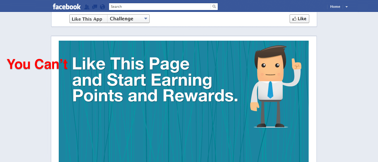
Facebook just updated its platform policies effectively banning the practice of “Like-gating” a feature found not only on our page tab apps, but in others as well.

This tactic has been pretty effective in generating (okay, forcing) incremental likes for pages. We’ve seen this work so many times and coupled with a great offer, translates to a win-win for everyone. But in light of declining newsfeed coverage and page reach, this is forcing all of us to find other ways to make social a high performing channel for our businesses.

The most immediate reaction of people now is towards enforcement. Considering that there are over millions of fan pages out there, a lot of people think that the arduous task of penalizing pages is almost impossible. Either way, if you’re running a promotion right now, it’s time to come up with a plan B.

Take A Step Back – Based on our experience, Facebook will always be the “assisting channel” so come up with ways to drive traffic to your site. It’s time to focus on optimizing images you use on your newsfeed, specially ones that link back to your site. There’s absolutely no one-size-fits-all approach to this and in fact, even the notion of post a picture and ask a question is not performing as well even. Always look at your post performance from time to time and optimize from there.

Focus on getting emails not likes – Email Campaigns provide better performance than just getting likes in terms of meeting your marketing objectives. Tab apps are still a great way to enhance your acquisition campaigns and designing your campaigns in such a way that it helps you collect emails will just increase your chances of converting users. Maybe you used to display a coupon right after a page is liked. You can just change the form by requesting for an email and sending the coupon straight to their inbox.

It’s time to put advertising to the mix – Well, this was inevitable. Long gone are the days of great organic traffic going to your page. Depending on how much you want to grow your likes, you can probably get likes from $0.05 to $0.90 running a well targeted campaign.

Just Move On – Facebook’s known to change its policies regularly and this wasn’t really much of a surprise (also, you might want to put down your pitch fork). If you’ve been doing a great job sharing great content and clearly engaging your users with or without these like gates, then you’re fine.

Are Likes Really a Big Deal Nowadays? Shift your focus to conversion optimization! 

Besides, your objective is to really drive conversions to your owned properties, it could be an app or your website. That’s so much valuable than “cheap” likes.

Blueprint: How to Create A Secure Downloads System in WordPress

One of our partners approached us with a pretty interesting requirement.  They currently manage a fund that operates businesses from a portfolio of  4 different industries. This means, they want to create a special section on their site for investor relations and downloads.

Can Our Investors Download Files Securely on our WordPress-powered Site? 

With their current site built on the WordPress platform, they wanted a  way to upload monthly, quarterly and annual financial reports as well  as investor decks for fund raising. On top of that, they also wanted to make sure that some files are only viewable to certain people. To illustrate, a fund investor will have access to all files while an investor that only placed money in one business will only have access to that folder.

They examined several options before, ranging from Dropbox/Box (cheap, but has little room for customization) to full-blown Enterprise Document Management systems (expensive and too cumbersome to deploy).

The Solution: It’s All About Using Plugins Creatively

Instead of building one from scratch, you can actually implement a bonafide file management system using a cocktail of WordPress plugins. The benefits from a cost and project timeline perspective makes this whole exercise worth looking at. While it’s not a one-size-fits-all solution, this approach should give you something that actually works!

For this tutorial you’ll be needing the following WordPress Plugins:

  • Download Manager – This will serve as the main engine of the file management page of your site. From here you’ll create folders and manage file access permissions.
  • WP Login Box – The idea here is to “hide” the WordPress interface to your end users. This plugin provides you with an embeddable login box on your downloads page.
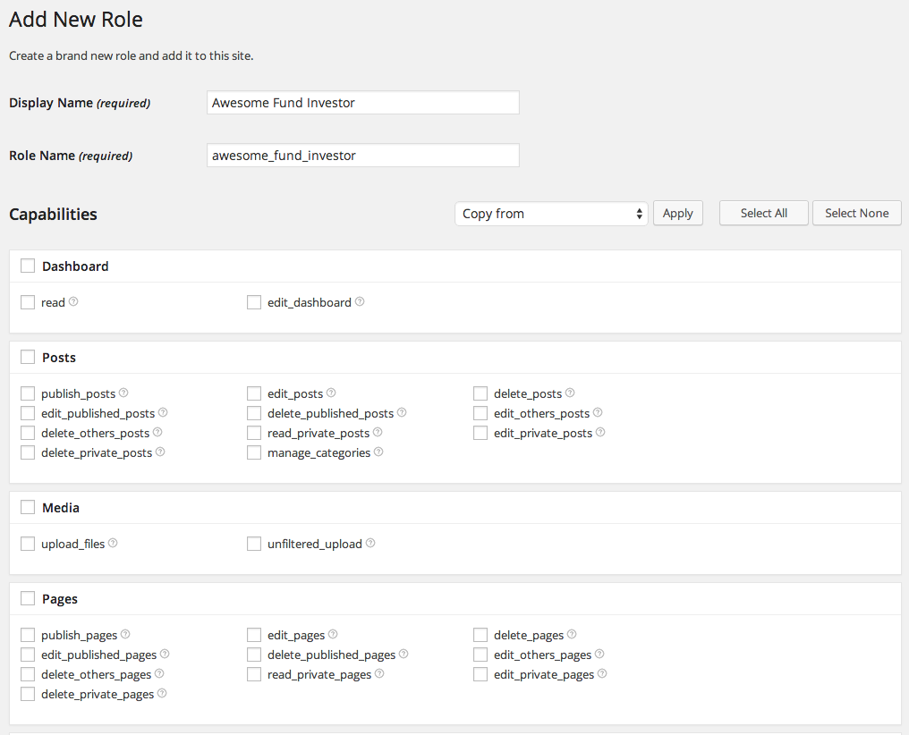
  • WPFront User Role Editor – You will need this to create custom user roles on top of standard WordPress default roles (I.e. Admin, Editor, Author, Contributor etc). We’ll need this because we have to create roles specific to your investors.

Of course this assumes that you already have an existing WordPress-powered website and have the ability to create pages without breaking your site template. This solution just requires a simple shortcode embed.

  1. Prepare Your Workspace – Make sure you’ve already installed the three plugins we mentioned above. It goes without saying that you should be doing this on your test server and have performed all the necessary backups necessary to perform this exercise.
  2. Create your Downloads Page – We are creating a special Downloads section on your site. You can do this by creating a vanilla WordPress page here and make sure that the page template you’re using is not meant for blog archives and other “specialized” pages. We want this to be as basic as possible. We’re essentially getting all these plugins to do the work for you.
  3. Create your custom roles – This is where the WPFront User Role Editor comes into play. For this exercise, you would want to create three types, Investor Type A (all access), Investor Type B (access to project 1), Investor Type C (access to project 2). Of course, the plugin won’t really ask where you plan to use these so as a rule of thumb. Just fill-in the display name and role name (or just the required fields). Leave everything blank.Creating_Roles
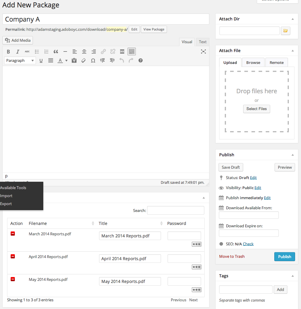
  4. Create your download folders – Okay, time to fire up your Download Manager setting by clicking on the link on the left pane. Click on “Add New”.Upload Files
  5. Upload Your Files – You’ll probably have your own way of organizing files. In this example, we’re sorting it by company (one of many). I uploaded three files here representing monthly reports.
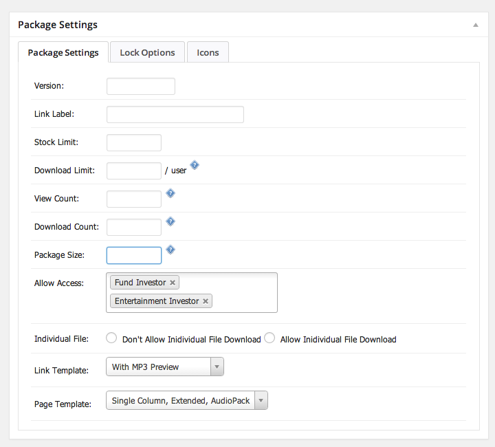
  6. Put Finishing Touches on the Folder  – You want to make sure that these folders are only accessible to users with all the necessary permissions. You can simply configure that from the same folder interface by scrolling down to the bottom. It uses all visitors by default so remove that first then add the correct user types in the “Allow Access” box.Upload Options
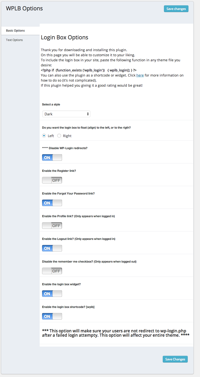
  7. Configure and Embed the Login Shortcode. – Just add the shortcode [wplb] on the downloads page.. It’s as simple as that. Make sure you emulate the settings here! WPLB_OptionsDownloads_Page
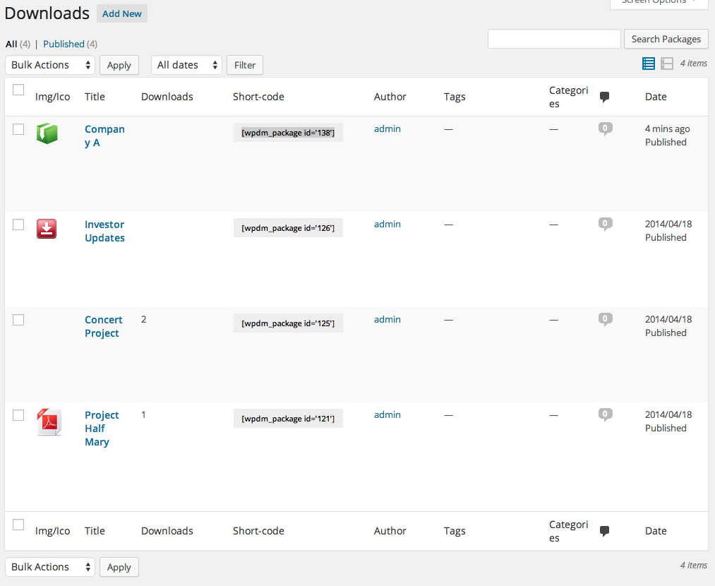
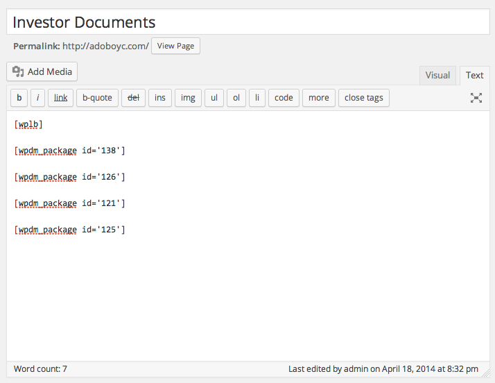
  8. Embed your packages.  – Same as what we did for the login box. Put ALL of the package shortcodes on the page.Edit_Page_‹_JC_Medina_s_Sandbox_—_WordPress
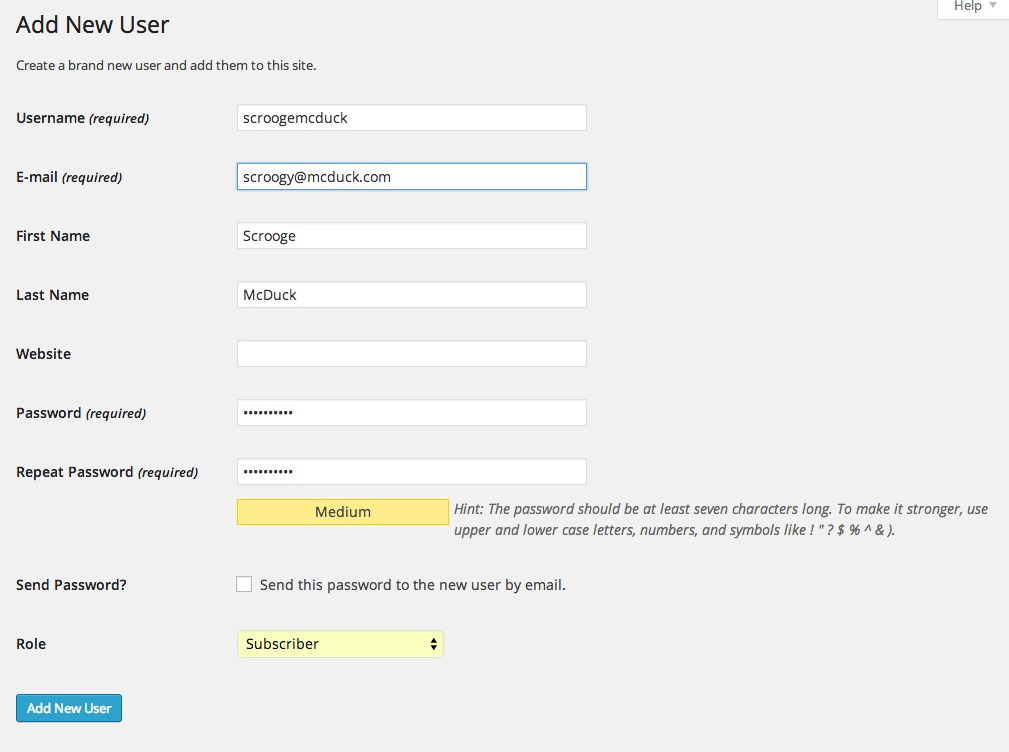
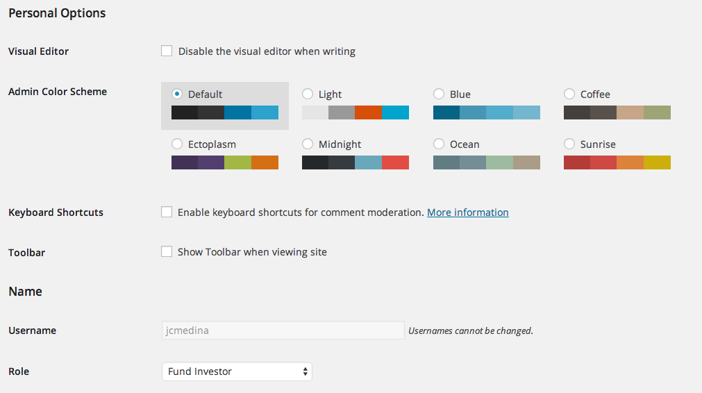
  9. Create Your User Accounts (don’t confuse this with roles)  – We want to hide the fact that we’re using WordPress here so as a good measure, just untick the box here.AddNew User_WordPressDisabling_the_WP_bar
  10. Change the CSS – Most of the plugins mentioned in this article allow you to put in your custom CSS. Just ask your developer to do this.

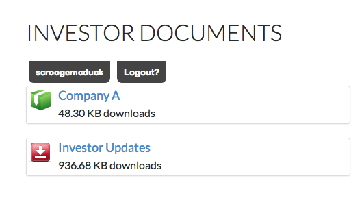
If you followed all these steps. The whole flow should look like this:

User Logs in...

User Logs in….

User Sees Multiple Folders

User Sees Multiple Folders


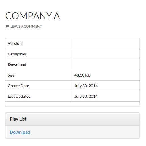
...and start downloading!

…and start downloading!

So there you have it! If follow all the instructions correctly (and your files are ready) you can do all of these steps in less than an hour.

Have you considered implementing other document management solutions on WordPress? Let us know!

Better Social Media Measurement with Google Analytics Solutions Gallery

FB_Share


Builtwith reports that over 71.1% of Quantcast’s Top 10k websites use Google Analytics. And with that, a strong community of users have shared nifty solutions that you can  add to your Google Analytics account.

If this is your first time to hear about Google Analytics’ solutions gallery, you’re not alone. We only found out about this when we decided to get a certified (for fun). And it’s been out since 2013!

Via the solutions gallery, you’ll have access to an expanding gallery of dashboards, reports, useful segments, goals and other toys to satisfy your inner analytics geek. With GA experts and thought-leaders sharing their dashboard configurations, you’ll be an analytics guru in no time.

Of course this assumes that you have an existing Google Analytics account. If you’re new to this analytics platform and want to poke your way around, we highly recommend that you complete their free training courses found here.

But wait, why are we talking about Google Analytics? Aren’t Facebook Insights enough to measure Social Media performance? If you’re a social media manager, you’d still want to synchronize with your digital marketing team and make sure that you’re making a measurable contribution to your site traffic and related goals. After all, conversion happens on your website.

Now that 4th of July weekend is upon us, let’s get cracking. These tools only take a few minutes to install. Revel in the data once when you get back from your holiday.

Here’s a list of our 3 favorite Social Media related Analytics tools.

Social Media Dashboard – Analytics evangelist Justin Cutroni’s dashboard is a must install for Social Media managers. In fact, if you only have time to install one, this is it.

This dashboard gives you a top-level view of how your Social Media campaigns are doing, sorted by network. As a rule of thumb, you should assign a dollar value to each visitor based on your past data. If you have goals setup on your analytics account, you’ll see each network’s performance as well.

Twitter Dashboard – Designed by Erik Wagner, this gives you deeper insights on your Twitter campaigns. We love how it reinforces the fact that Twitter is indeed a mobile heavy platform. As such, this should give you some input on the content you post and consequently, how your responsive site is performing.

Social Media Network Analysis – Advanced Traffic Segmentation – Prepared by the Teknicks team, this solution is a pretty helpful and time-saving segmentation bundle that allows you to quickly isolate traffic from each social network.

So those are just 3 solutions that we love of the lot. Feel free to install more!

The Almost Last-Minute Guide to the New Facebook Page Layout

Have you upgraded your page to the new Facebook Page layout? Do you like it?

Announced by Facebook in March this year, we upgraded our page a couple of weeks ago and we’ve gathered enough thoughts to actually have a fair assessment of the new layout.

The verdict is…we like it!

At the onset, you’ll see major differences on the way your page is administered. The old page manager overview page is gone and replaced by a page management bar on top of your page. There’s a special emphasis on managing notifications and messaging while ad management and settings are generally the same.

In terms of the look and feel, the new layout is much streamlined as compared to its predecessor, making it slimmer since we’re just dealing with one column for your timeline.

But the meat of this change really lies with the left sidebar. Originally confined to the top-page of the page, you now have to contend with a prominent sidebar that displays helpful information to the visitor.

Still wary? Unfortunately, Facebook will automatically upgrade your page to the new version on June 20 so it would be good to know what to expect from these changes. You have 8 days so let’s get cracking!

Revisit Your Header Image

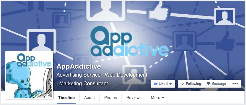
If you haven’t fixed your header image yet, now’s the time to do it. One major difference seen with the new layout is the page name is now part of the header image area.

Take a look at this:

AppAddictive

While it certainly looks nicer, it definitely not working with the original background image that we had. We need more oomph, more contrast.

What we did was come up with a new image (851×315 pixels) with this in mind and here’s the result….

New_AA_Page_Header

Isn’t that Better? Of course this was made possible with help from Jon Loomer’s helpful guide on Facebook Image Dimensions.

Your Visual Content Marketing Needs to Step Up

Let’s just keep things simple. Try to minimize (if not avoid) all status updates and just shift to a either photo or link posts.

Now that we’re just down to one column for our fan pages, it’s imperative that we shift all attention to content that converts. Are you a bit concerned on where you’ll get your images? We recommend tools like Canva to get the job done fast and cheap. We really don’t have any excuses anymore!

Choose your Subcategories Well

We’re only saying this because it gets top billing on your site category. But yes, it does help with the overall search performance of your page.

If you’re a local business providing services like home repairs then you’re fine. As for the rest of us, we really have to do a little bit of soul-searching and make sure that assign subcategories applicable to your what you guys really do.

But don’t go overboard! Try limiting it to three at most.

How Should I Manage my Sidebar?

One thing you have to realize is that you can actually REORDER the placements of all these widgets to the left. The catch here is that you CANNOT rearrange the first two widgets on top which would be PEOPLE (the ones that contain reviews) and ABOUT.

It goes without saying that you need to fill-up all items on your ABOUT settings. If you haven’t done that, now’s your chance to update it.

It really depends on the kind of page you have. If you’re a local business, you can display other pages in your immediate community (the LIKED BY THIS PAGE widget) and bump it up. You can do the same with reviews and photos. In our case, we’d like to showcase our apps so that goes right under about.

Do I Have to Shift My Attention to Reviews?

Reviews – a feature that was originally confined to the right sidebar figures more prominently on the new layout. So the answer is YES.

If you haven’t gathered enough reviews on your site, try to come up with programs to encourage people to write reviews on your site. You can promote your page on your mailing list, on your website. But if you have a kickass product or service and you make your customers happy, then reviews are the least of your problems.

Are page apps being downplayed here?

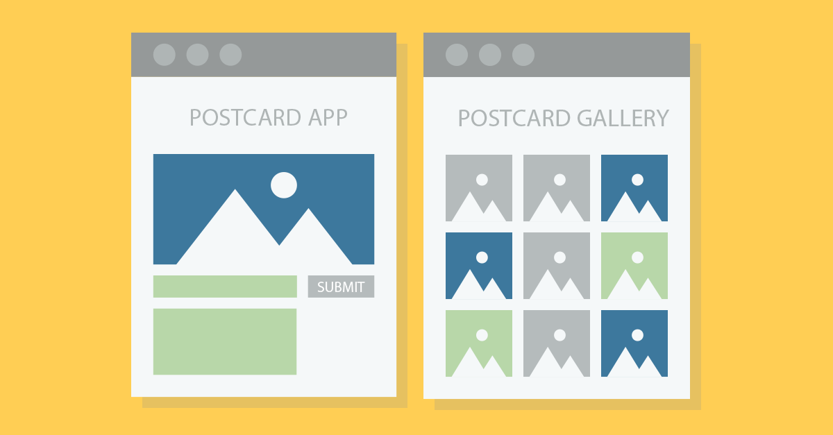
Some people are saying that page tab apps are now taking a backseat with the new layout. We beg to differ. Apps, done right should still be an effective tool in your Facebook marketing arsenal. The core dimensions of Facebook pages remain that same and you can still like-gate them, specially if you’re running sweepstakes. Or our favorite app for conversion…the postcard app!

The same rules apply here, make sure your 111x74px images are optimized and it should grab the attention of your users.

So there you have it! Take these concepts in mind and you’ll be alright by June 20. Good luck!

10 Website Custom Audience Secrets Your Facebook Ad Agency Should Know

You have felt like this before.  You  remarket on Facebook but you have to use third-party pixels. What a pain, isn’t it? You ask, “Why can’t Facebook be more like  Google Adwords which allows you to remarket seamlessly with their Google Analytics?”

[Read more…]

The Shocking Results of Our Own Split Test of Our Free Ebook Sign-up Page

Guess which landing page resulted in more sign-ups for our Ebook?  The Top one or the Bottom one?

We tested these 2 variants. Result: The bottom landing page consistently outperformed the top one, by almost 90%. The bottom one generated almost twice as many leads as the top one.

The results are somewhat counterintuitive because we initially had a theory that the appearance of top brand logos and testimonials will generate more sign-ups. It turns out that most probably, the clutter actually got visitors distracted from actually filling the form!

Every online business should have a discipline of testing their landing pages because no matter what experts advise, there just might be something with your visitors, your product or your design that leads to results contrary to expectations.