First a disclaimer: Especially in social media, there are no such things as rules in conversion rate optimization. What works in one situation may not be the same for another.
Nevertheless, there are a number of hardwired human traits and behavioral patterns understood by psychologists, behavioral economists and other social scientists that we can use to increase our conversions. Our experience working with conversion rate optimization has given us some interesting insights as well. Contact us about conversion rate optimization for your web site or your organization!
Here are 12 brands identified by Econsultancy that used such principles and have worked. You might want to test them out yourself for your own brand and explore.
Social Proof
One of the most effective things you can bring to your site to increase the confidence of buyers is ‘social proof’. Social proof is the phenomena where people tend to believe that the decision and actions of others reflect the correct behavior in a specific situation. So, we have to create an experience which convinces our visitors they’re not the only person making this decision.
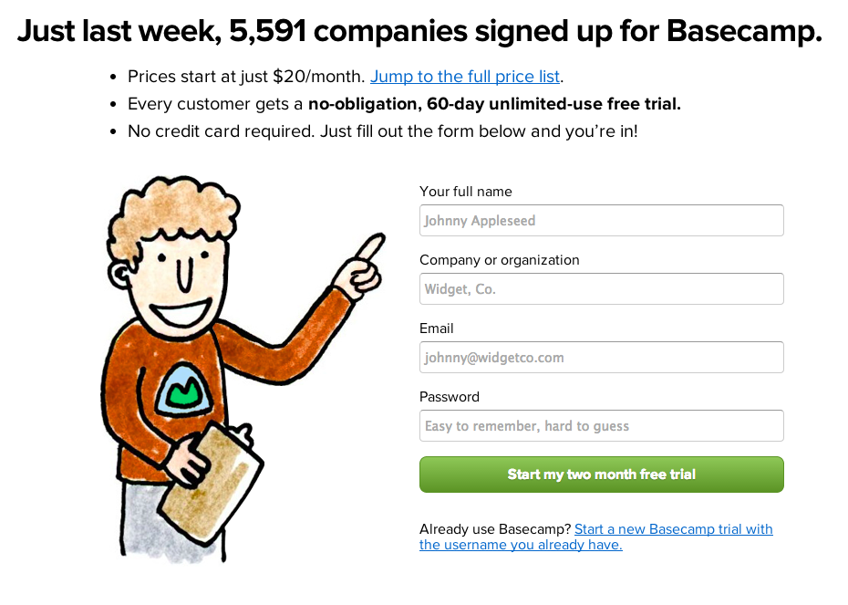
Basecamp Social Proof Techniques
Basecamp
In this design we see a prominent mention of the sheer number of other people who have made the same purchasing decision that the visitor is considering.
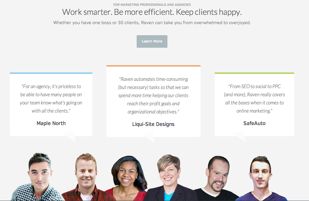
Raven SEO Tools
One of the most common ways to integrate social proof into your site is by including testimonials into your site, especially if you can include a picture of the person providing the social proof. Software as a Service (SaaS) companies are the kings of this. But it’s a sensible addition to most B2B sites and can also work well in B2C environments.

There’s a huge number of clever CRO techniques in place on this page but we want to highlight one of the easiest ways to implement social proof into your site, using the off-the-shelf Facebook Like button/widget. It really simply shows you the profile pictures of other people who’ve liked that page on Facebook, also prioritizing those who are connected the to the visitor of the site.
It is not just social proof, but personalised social proof. Actually it’s even better than that. It’s automated personalised social proof.
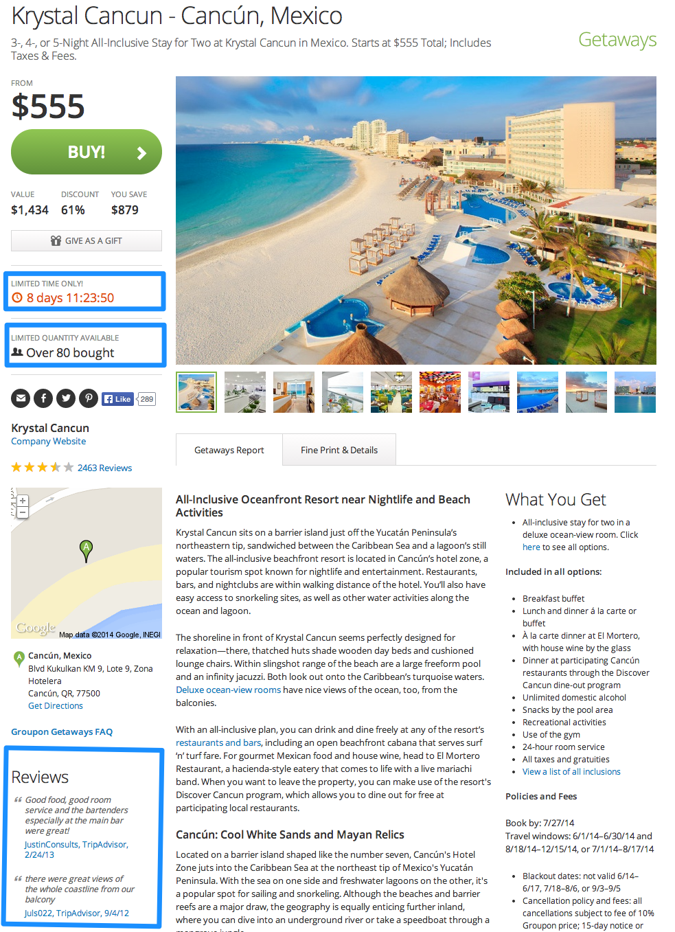
Groupon
Yes Groupon. It might have been getting a lot of stick recently but it, more than nearly every other major internet business, has a deep understanding of human behavior. Here it illustrates how they’ve built social proof into the very DNA of its business.
By showing how many other people have bought the same offer, Groupon hopes to persuade the visitor to do the same, and place an order.
Loss Aversion
The disutility of giving up an object is greater than the utility associated with acquiring it. This is known an Loss Aversion. ‘Disutility’ simply means that human tendency prefers not to lose something more than we love to gain something. Sometimes this is about a subtle re-framing of your copy to concentrate on loss rather than gain. We need to ask ourselves ‘How can we make visitors think they’d be losing something if they don’t buy?’.
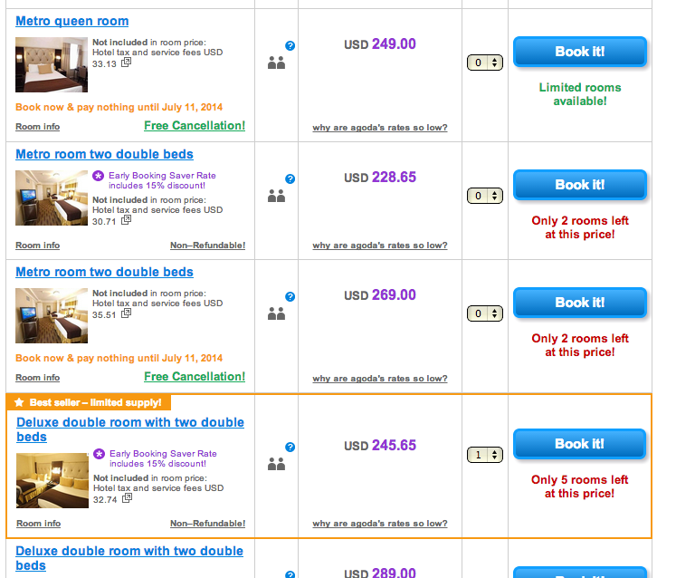
Agoda
Many travel websites are particularly good at communicating loss aversion. A good example is Agoda. It makes it clear what you would lose if you don’t book now. This serves to instantly increase urgency.
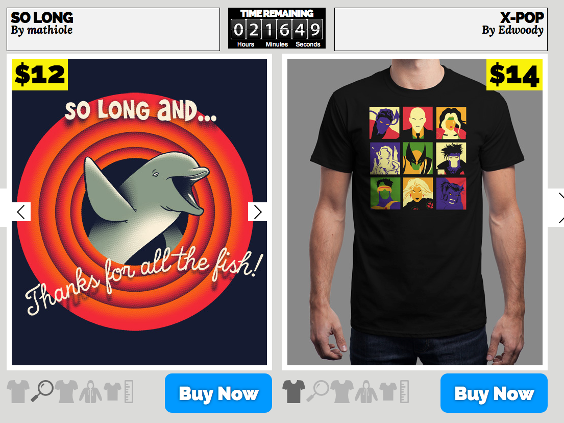
Qwertee
Qwertee has built an understanding of human behavior right into its business model. Its t-shirts are only available for 48 hours and after the first 24 the price increases. Every time you visit the site there’s a huge ticking clock showing exactly what you’re going to miss out on if you don’t purchase soon.
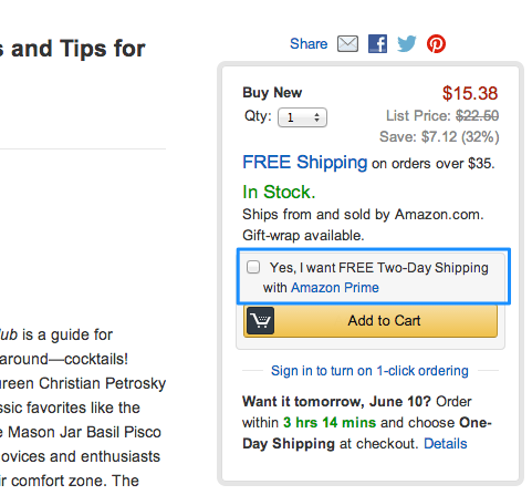
Amazon
Amazon is the king of using cognitive biases to increase conversion rates. One particular example where it uses loss aversion is for its ‘Prime’ customers. Prime users are a subset of their most frequent customers who have paid upfront fees to have access to next day delivery by default. If you’re a signed-in Prime customer, every product you visit that has next day delivery reminds you how long you’ve got before that day’s cut-off point.

Argos
It’s not just online giants like Amazon making use of our innate loss aversion to increase purchases. High street retailer Argos taps into our aversion to loss to drive footfall to its shops using this clever lightbox.
Anchoring
One of my favourite cognitive biases that influences the way behave, is known as anchoring. It is the tendency to rely too heavily – or ‘anchor’ – on a past reference or on one trait or piece of information when making decisions. These anchors can often be numerical. Our challenge is to ask ‘How can I reference an ‘anchor’ that influences visitors to my site?’.
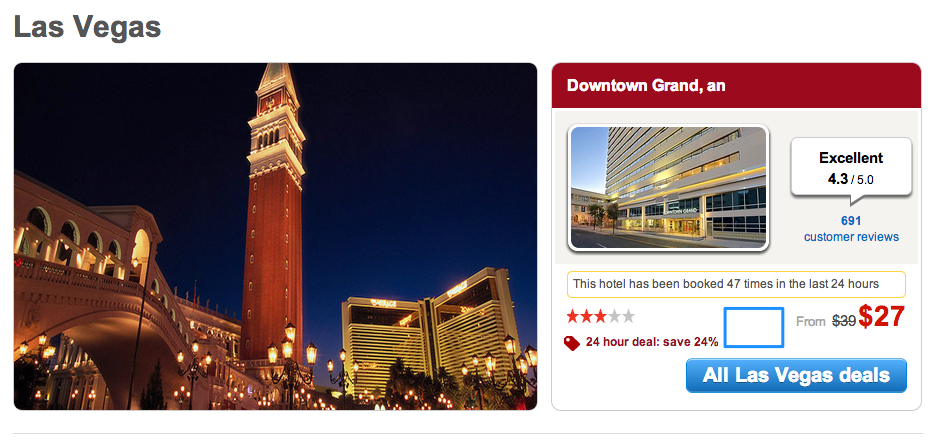
Hotels.com
One of the oldest anchoring tricks in the book is what the price was reduced from. Cross-hatched higher prices showing the available discount is a simple way to anchor the price of an item and make it seem better value.
Mailchimp
SaaS companies like MailChimp often make use of a clever anchoring technique that more businesses should be wise to try and use. You’ll notice they have one high price that’s much higher than all the other price points. This maybe be because it’s a popular option. However many anchoring experiments have found introducing one higher price point can lead to people spending more in total even if nobody chooses that option.
This concept is worth repeating because it is a bit counter-intuitive: Adding an extra expensive option to your page can increase the average order value of the page even if nobody selects that option. This is because it makes your other expensive options seem less expensive. This is one that’s well worth testing.
There’s also a case of possible anchoring taking place on the homepage of Broadband.co.uk, where the BT offer is significantly more expensive than the other options. That’s because the package is very different to the others. If we believe in the principle of anchoring, this may be increasing the value of the traffic to this page by encouraging them to assess the relative value of the other options differently.
Wiggle
Adding related products to a page can be a great way to increase the number of items people add to a basket. There’s also a possibility that the selection of these products might also have an anchoring influence. We don’t expect too many retailers bear price anchoring in mind with their related product algorithm, but it’s something you would expect some retailers to have tested.
As we noted at the beginning of this article, we don’t always know in every case that these changes have been implemented to increase conversion rates. However, if we understand human behavior and some of our cognitive biases, they would certainly seem worthy efforts to try.