Have you upgraded your page to the new Facebook Page layout? Do you like it?
Announced by Facebook in March this year, we upgraded our page a couple of weeks ago and we’ve gathered enough thoughts to actually have a fair assessment of the new layout.
The verdict is…we like it!
At the onset, you’ll see major differences on the way your page is administered. The old page manager overview page is gone and replaced by a page management bar on top of your page. There’s a special emphasis on managing notifications and messaging while ad management and settings are generally the same.
In terms of the look and feel, the new layout is much streamlined as compared to its predecessor, making it slimmer since we’re just dealing with one column for your timeline.
But the meat of this change really lies with the left sidebar. Originally confined to the top-page of the page, you now have to contend with a prominent sidebar that displays helpful information to the visitor.
Still wary? Unfortunately, Facebook will automatically upgrade your page to the new version on June 20 so it would be good to know what to expect from these changes. You have 8 days so let’s get cracking!
Revisit Your Header Image
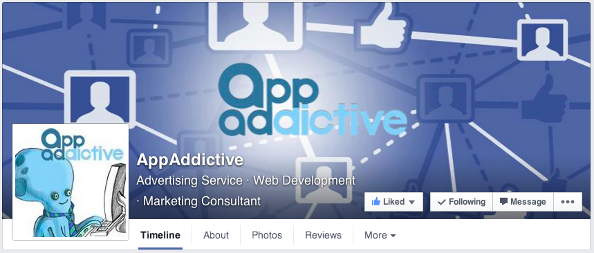
If you haven’t fixed your header image yet, now’s the time to do it. One major difference seen with the new layout is the page name is now part of the header image area.
Take a look at this:
While it certainly looks nicer, it definitely not working with the original background image that we had. We need more oomph, more contrast.
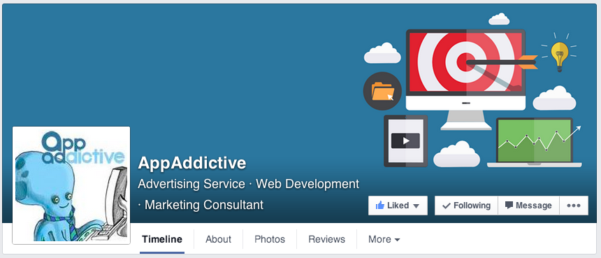
What we did was come up with a new image (851×315 pixels) with this in mind and here’s the result….
Isn’t that Better? Of course this was made possible with help from Jon Loomer’s helpful guide on Facebook Image Dimensions.
Your Visual Content Marketing Needs to Step Up
Let’s just keep things simple. Try to minimize (if not avoid) all status updates and just shift to a either photo or link posts.
Now that we’re just down to one column for our fan pages, it’s imperative that we shift all attention to content that converts. Are you a bit concerned on where you’ll get your images? We recommend tools like Canva to get the job done fast and cheap. We really don’t have any excuses anymore!
Choose your Subcategories Well
We’re only saying this because it gets top billing on your site category. But yes, it does help with the overall search performance of your page.
If you’re a local business providing services like home repairs then you’re fine. As for the rest of us, we really have to do a little bit of soul-searching and make sure that assign subcategories applicable to your what you guys really do.
But don’t go overboard! Try limiting it to three at most.
How Should I Manage my Sidebar?
One thing you have to realize is that you can actually REORDER the placements of all these widgets to the left. The catch here is that you CANNOT rearrange the first two widgets on top which would be PEOPLE (the ones that contain reviews) and ABOUT.
It goes without saying that you need to fill-up all items on your ABOUT settings. If you haven’t done that, now’s your chance to update it.
It really depends on the kind of page you have. If you’re a local business, you can display other pages in your immediate community (the LIKED BY THIS PAGE widget) and bump it up. You can do the same with reviews and photos. In our case, we’d like to showcase our apps so that goes right under about.
Do I Have to Shift My Attention to Reviews?
Reviews – a feature that was originally confined to the right sidebar figures more prominently on the new layout. So the answer is YES.
If you haven’t gathered enough reviews on your site, try to come up with programs to encourage people to write reviews on your site. You can promote your page on your mailing list, on your website. But if you have a kickass product or service and you make your customers happy, then reviews are the least of your problems.
Are page apps being downplayed here?
Some people are saying that page tab apps are now taking a backseat with the new layout. We beg to differ. Apps, done right should still be an effective tool in your Facebook marketing arsenal. The core dimensions of Facebook pages remain that same and you can still like-gate them, specially if you’re running sweepstakes. Or our favorite app for conversion…the postcard app!
The same rules apply here, make sure your 111x74px images are optimized and it should grab the attention of your users.
So there you have it! Take these concepts in mind and you’ll be alright by June 20. Good luck!


dear sir
i want sale my product online , so m searching app for sale
I am in fact thankful to the holder of this web site who has shared this impressive post at at this time.
Great web site. Lots of helpful info here. I¡¦m sending it to a few friends ans also sharing in delicious. And obviously, thanks for your effort!